Experimental #
Our styling/component documentations are experimental and under development. These could change any time without even notice. So, please be careful before you using it.
Input Components #
Input components can make beautiful inputs on your HTMLwithout doing much things.
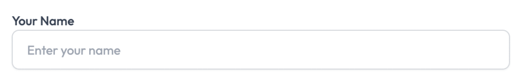
Basic Input Component #
Basic input does do things with just form-control class.
Code:
<label for="name">Your Name</label>

<input type="text" name="name" id="name" required="" autofocus="" value="" placeholder="Enter your name" class="form-control">
Preview:
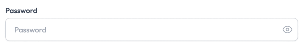
Password Input component #
This component can show beautiful password like component without doing much things
Code:
<x-inputs.password
   name="password"
   label="{{ __('Password') }}"
   placeholder="{{ __('Password') }}"
   required
/>
Preview:
Combobox Input component #
This component can show combobox or dropdown instead default select.
Code:
@php
    $statusOptions = ld_apply_filters('post_status_options', [
        ['value' => 'draft', 'label' => __('Draft')],
        ['value' => 'publish', 'label' => __('Published')],
        ['value' => 'pending', 'label' => __('Pending Review')],
        ['value' => 'future', 'label' => __('Scheduled')],
        ['value' => 'private', 'label' => __('Private')],
    ]);
    $currentStatus = old('status', $post->status ?? 'draft');
@endphp

<x-inputs.combobox
    name="status"
    label="{{ __('Status') }}"
    :options="$statusOptions"
    :selected="$currentStatus"
    :multiple="false"
    :searchable="false"
    x-model="status" />
Preview:

Learn more about combobox component.


